LUrnex
A Seamless Skill Learning & Networking Platform
Overview
Lurnex is a modern skill-learning and networking mobile application designed to help users learn new skills, connect with industry experts, and track their progress—all in one intuitive platform. Built with a clean, minimalistic, and premium UI, Lurnex provides a smooth and engaging experience for users looking to upskill and grow professionally.


My Role
As the UI/UX Designer for Lurnex, I designed a visually appealing and highly functional user interface that enhances the learning experience. I focused on creating a structured and interactive flow that allows users to effortlessly explore learning resources, connect with mentors, and track their progress.
Design Approach
Designed with a clean, intuitive layout that prioritizes usability and aesthetics.
A well-structured information hierarchy for easy access to learning resources and networking features
Ensured a cohesive visual identity across all app screens, including typography, color schemes, and iconography.
Designed with accessibility in mind, offering both themes for user preference.
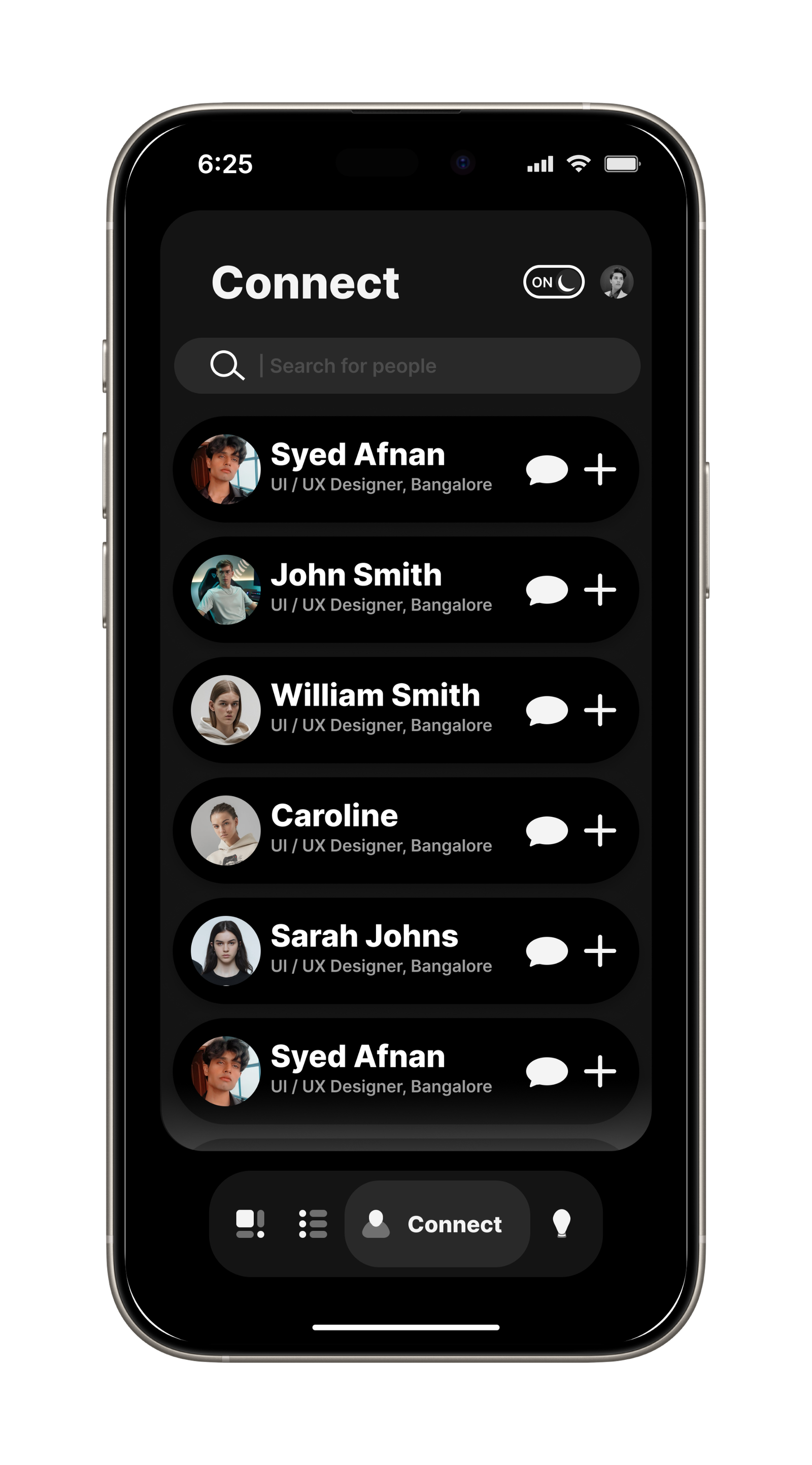
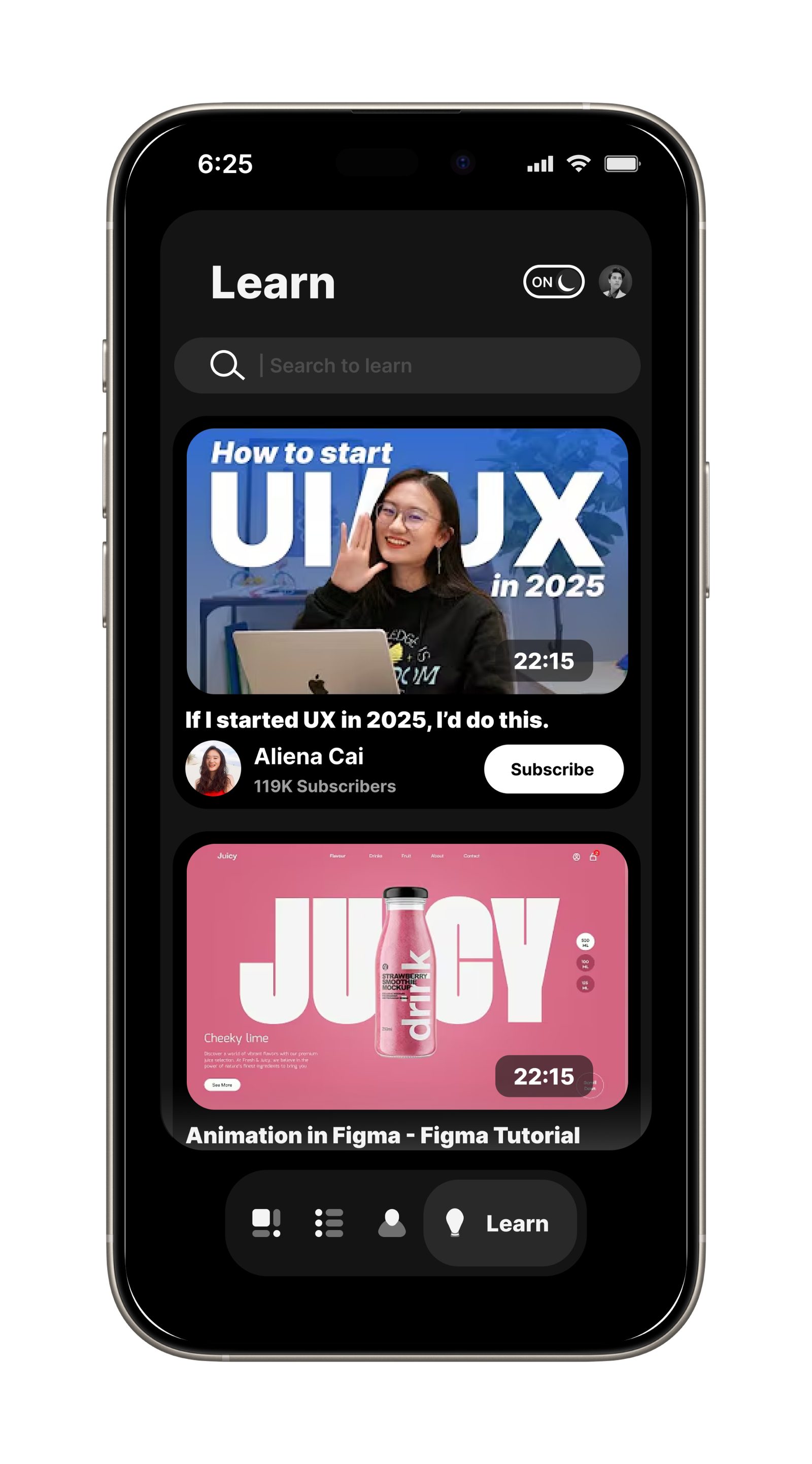
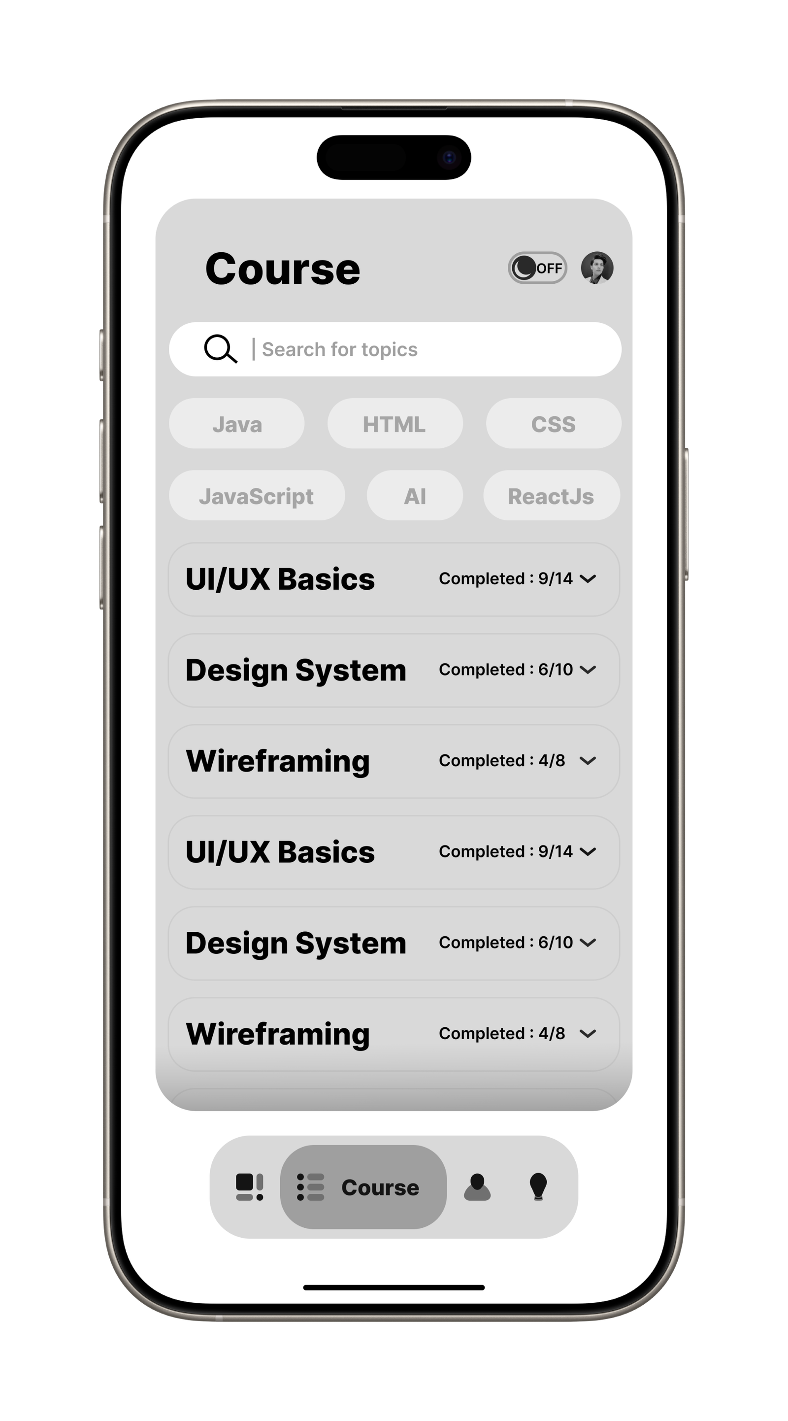
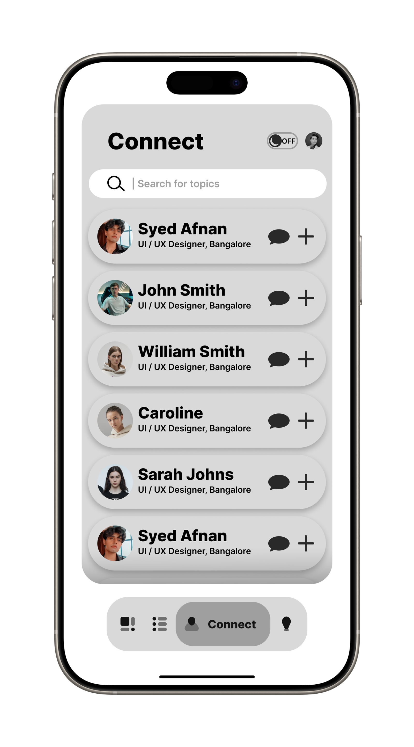
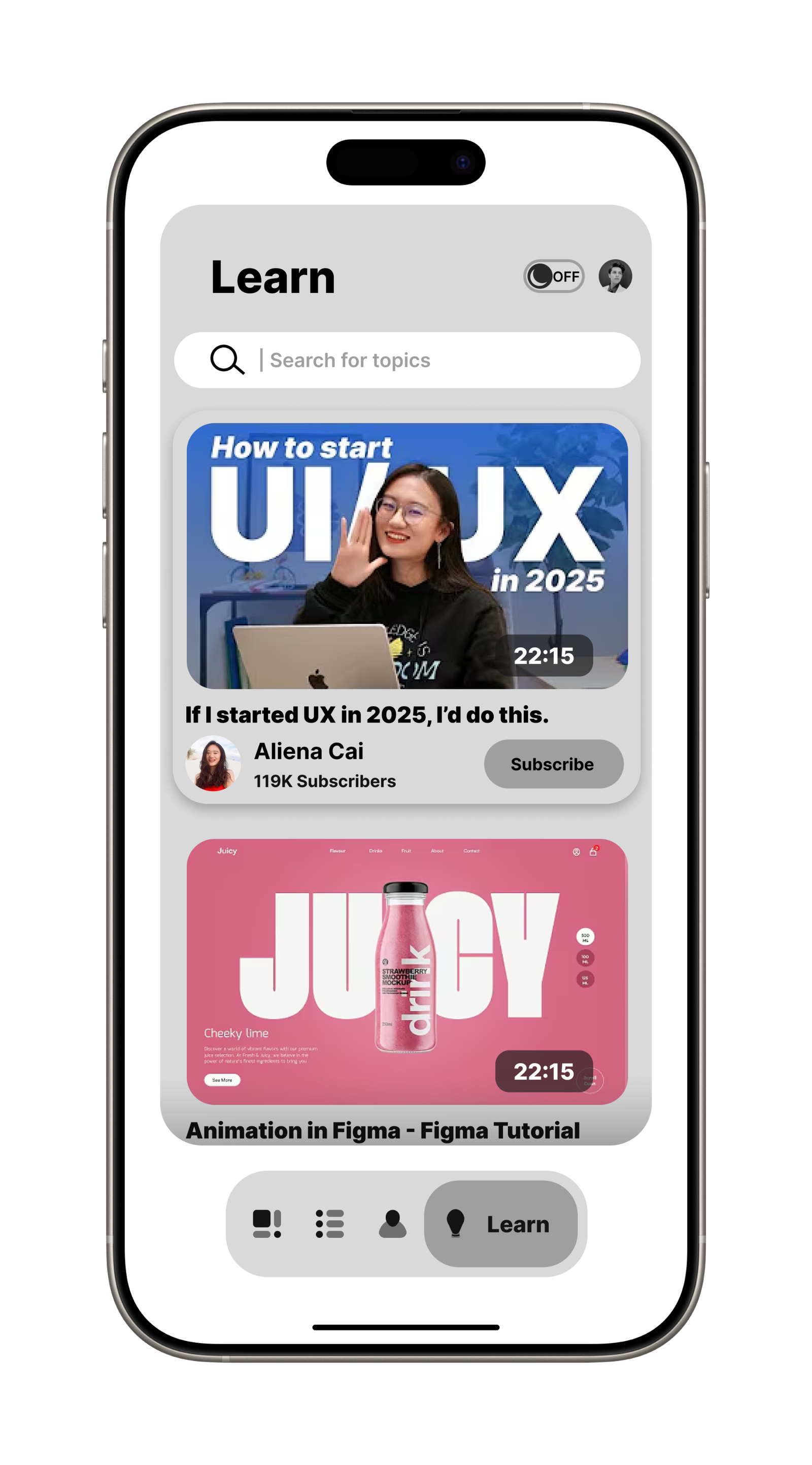
Key Features of Lurnex
Users can explore various courses tailored to their interests and career goals.
A dedicated section for connecting with professionals, mentors, and like-minded learners.
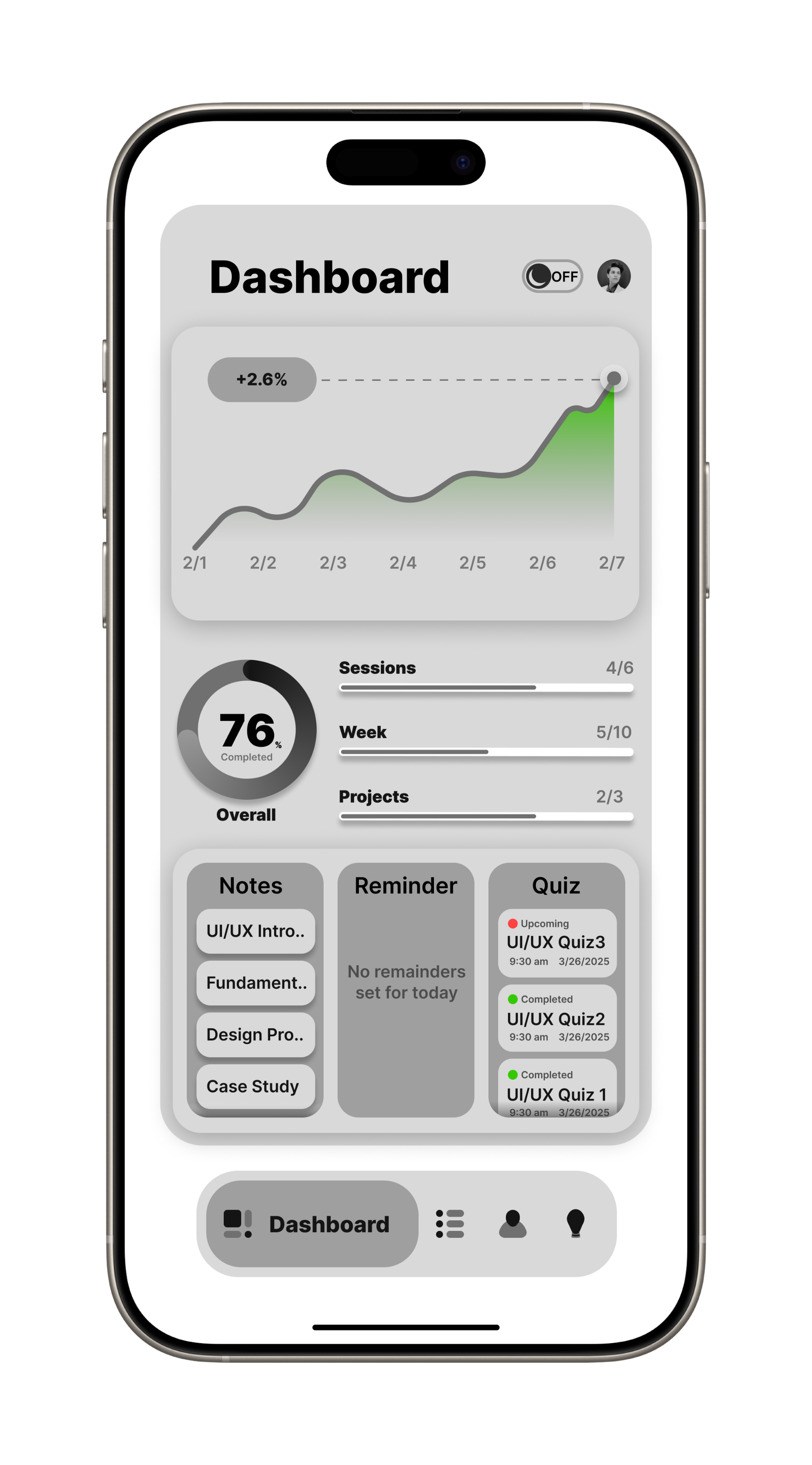
Users can monitor their learning milestones and achievements with a structured dashboard.
Engaging design elements such as cards, modals, and progress indicators to improve user interaction.
Designed for both iOS & Android, ensuring a seamless experience across devices.
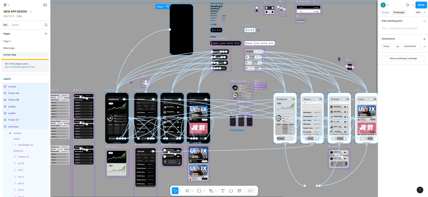
The Process
Analyzed user needs, identified pain points, and studied competitors to create a seamless learning and networking experience.
Designed low-fidelity wireframes to map intuitive navigation and user flow, ensuring clarity and ease of use.
Created high-fidelity, minimalistic UI with engaging visuals, interactive elements, and a smooth, responsive experience.
Conducted usability testing, gathered feedback, and iterated designs to enhance accessibility, usability, and engagement.
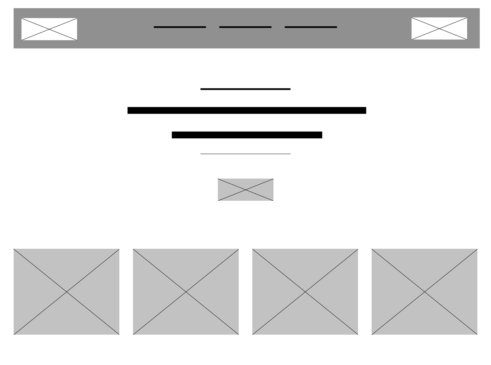
LURNEX UI
Fazplay
A Premium Gaming Fashion Brand Website
Overview
Fazplay is a premium gaming fashion brand that blends cutting-edge streetwear with gaming culture. I worked extensively on designing their website, product pages, and apparel while ensuring a seamless brand identity across digital and physical platforms. My role encompassed UI/UX design, front-end development, branding, and graphic design, contributing to the brand’s strong online presence.

Website Design & Development
I designed and developed the Fazplay website to provide an engaging and premium shopping experience for gamers. The focus was on modern UI, intuitive navigation, and high-performance responsiveness.
- Created wireframes and high-fidelity mockups in Figma.
- Ensured a minimalist, sleek, and premium look aligned with gaming culture.
- Focused on user-friendly navigation, easy product discovery, and a seamless checkout process.
- Developed the website using HTML, CSS, JavaScript, and WordPress (Elementor & WooCommerce).
- Implemented custom animations, hover effects, and smooth scrolling for an immersive experience.
- Optimized the website for fast loading speeds and mobile responsiveness.
- Integrated WooCommerce for effortless product management.
- Set up payment gateways for seamless transactions.
- Designed product detail pages with high-quality images, descriptions, and size guides.
Apparel & Graphic Design
Beyond web development, I played a crucial role in designing Fazplay’s apparel collection, ensuring that each piece reflected the brand’s gaming aesthetic.
- Designed high-quality gaming-themed apparel using Photoshop, Canva & Illustrator.
- Focused on bold typography, dynamic graphics, and premium aesthetics.
- Ensured print-ready formats for manufacturing.
- Edited and color-graded product images to enhance visual appeal.
- Created mockups to visualize designs before production.
- Designed logos, promotional banners, and social media graphics.
- Created Facebook ad creatives & Instagram promotions to enhance online engagement.
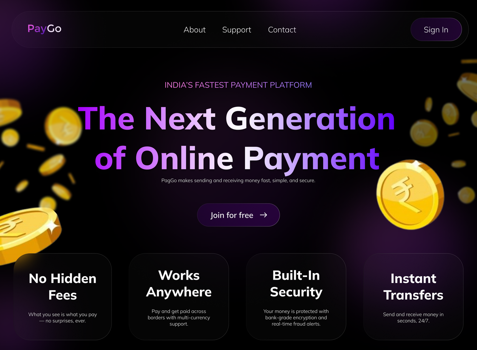
Paygo
A Fast & Secure Payment Platform
Overview
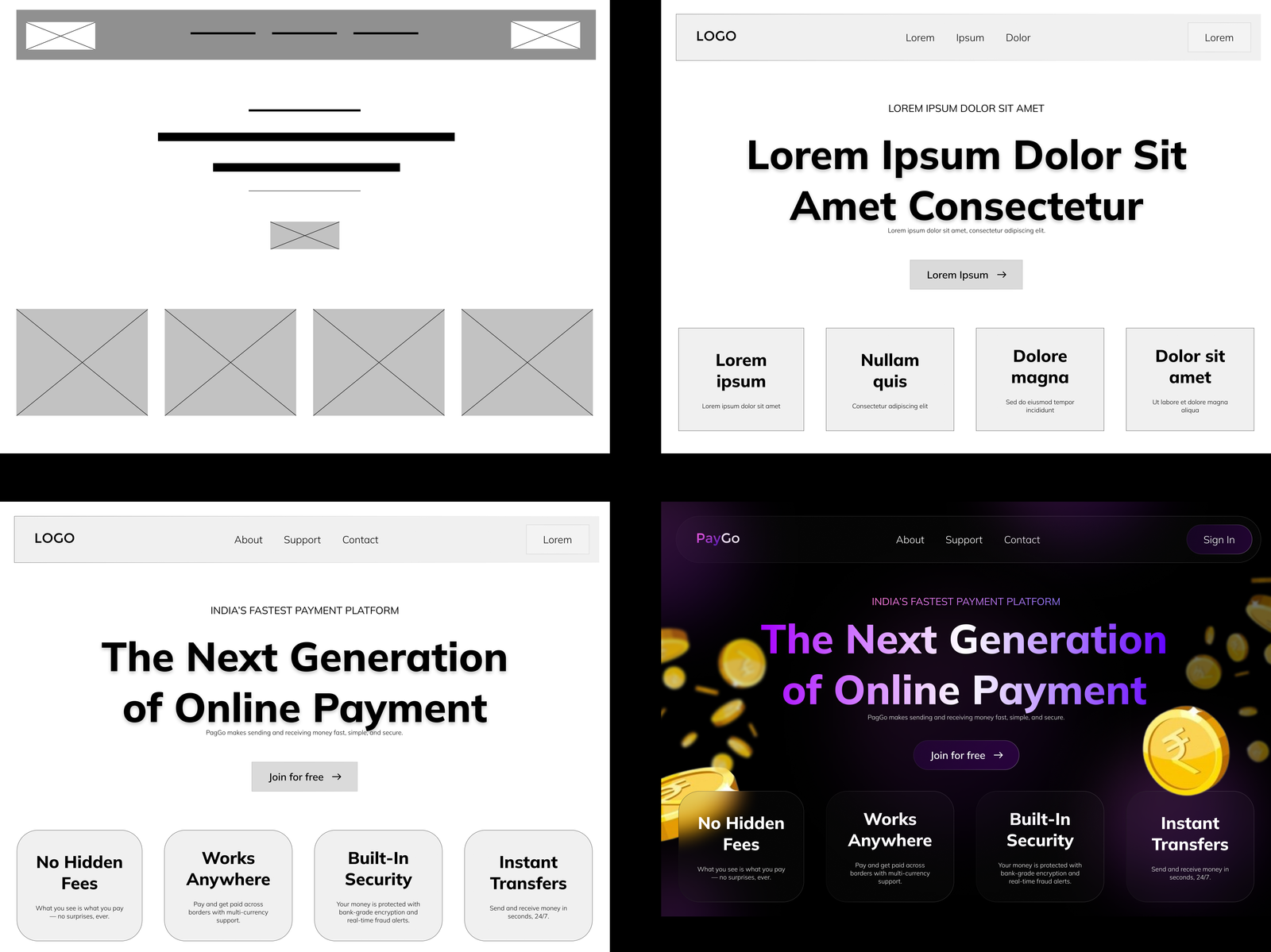
I designed a concept website for PagGo, a modern and minimalistic digital payment platform focused on fast, secure, and hassle-free money transfers. The goal was to create a clean and intuitive user experience that builds trust and reflects the simplicity of the service like no hidden fees, instant transactions, and bank-level security. From wireframes to high-fidelity designs, I crafted a smooth, responsive interface with thoughtful animations and bold typography to highlight PagGo’s core values of transparency, speed, and ease of use.
My Role
As the UX/UI Designer for PagGo, I focused on designing a clean and engaging concept landing page that captures the brand’s core values speed, simplicity, and trust. My role involved crafting a visually minimal yet informative layout that clearly communicates key features like instant transfers and no hidden fees, while ensuring a smooth and intuitive first impression for users.
PAYGO UI
Stagetimer
Remote-controlled Countdown Timer.
Overview
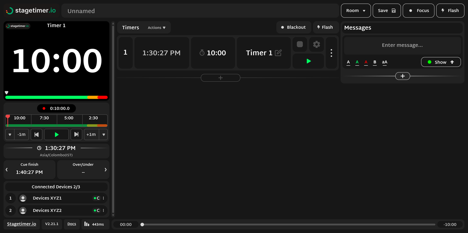
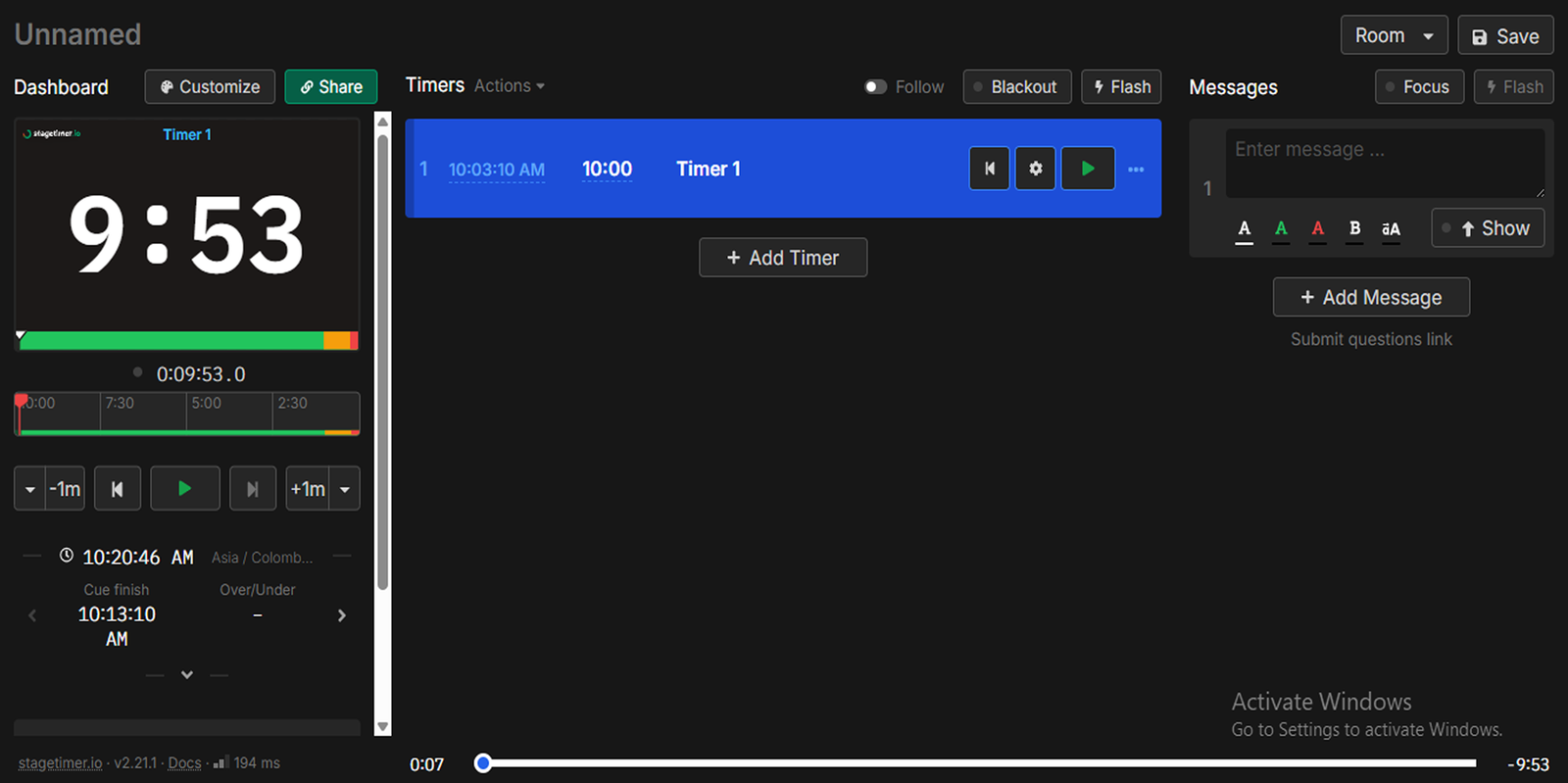
Stagetimer.io is a platform designed to assist speakers and presenters in managing their speaking time during presentations or performances. It provides a timer interface that helps users stay on track and ensures that time constraints are adhered to. Despite the utility, the platform had potential for improvement in terms of UX and UI. By applying Gestalt principles and best practices in user experience design, I refined the interface to make it more intuitive, visually engaging, and user-friendly.
My Role
As a UX Designer, I took full responsibility for rethinking and enhancing the platform’s user experience and interface. Understanding the core needs of users and identifying usability issues. Creating a visually appealing and cohesive design that aligns with user expectations and platform functionality. Applying principles of usability, Gestalt principles, and accessibility to improve the overall experience. Creating high-fidelity mockups and iterating based on user feedback.
Design Approach
Designed with a clean, intuitive layout that prioritizes usability and aesthetics. Aiming for simplicity, I eliminated unnecessary elements and clutter, focusing on what’s essential for the user. This makes the platform feel less overwhelming and encourages focused interaction.
I leveraged Gestalt principles like proximity, similarity, and closure to enhance visual hierarchy and organization. Grouping related elements and establishing visual relationships helped users process information quicker and more naturally.
The design was made fully responsive to ensure a seamless experience across various devices, including desktops, tablets, and smartphones. This adaptation ensures the platform can be used in different environments and situations.
I adopted an iterative approach, constantly refining and evolving the design. User testing and feedback were integral to fine-tuning features and interface elements for optimal user satisfaction.
Focused on the needs, goals, and behaviors of the users. I conducted user research to understand pain points and tailored the design to solve real user problems, ensuring that the platform serves its purpose efficiently.
Key Features of Stagetimer
Users can set their own time limits, with customizable start and end times, ensuring flexibility for different types of presentations or performances.
The timer displays color changes (green, yellow, red) to visually communicate the time remaining, helping users stay on track without needing to look at the clock constantly.
This feature allows the timer to take up the entire screen, making it easier to see from a distance, especially in larger presentation settings or on stage.
Customizable audio cues that alert users when they’ve reached specific time milestones, helping them gauge their progress without having to look at the screen.
The timer shows a visual countdown that decreases progressively, providing users with an intuitive representation of how much time they have left, fostering better time management.
The Process
I started by understanding the target users of Stagetimer, identifying their needs, and investigating the current UX/UI issues, helped pinpoint pain points and areas for improvement.
I studied other time management and presentation platforms to identify industry standards and see how Stagetimer could differentiate itself in terms of usability and features.
After gathering insights, I created wireframes and prototypes to explore layout options and interactions. This helped visualize how users would engage with the platform.
With the prototypes in hand, I conducted usability tests with real users, gathering feedback on the design, usability, and functionality. Based on the insights, I iterated the design to ensure it was intuitive and efficient.
I created high-fidelity mockups and prepared design assets for development and approached the support team for further collaboration.
STAGETIMER UI